Responsive Design is an approach to web design that allows web pages to render well on any device (computer, phone, tablet), regardless of windows or screen sizes.
Try this out: on this very screen, change the window size in your navigator –make it narrower or smaller or bigger. You’ll see how elements accommodate automatically and the page can still be read well, despite the size changes.
That is responsive design in action, and needless to say, it’s extremely useful for users.
What is responsive design for?
Responsive design was made to help users enjoy web content at ease, no matter which device they are using to access such content.
In order to have a better understanding of its importance, let’s go over a short account on how the internet has changed along the last three decades.
The early stages of the internet
Web pages have evolved enormously since the internet first appeared, just as it happened to electronic devices. By the end of last century, only desktop computers could connect to the internet and most of them had limited resolution monitors.

During quite a long time there was a caption at the bottom of many web pages that read something like: “This page is fully displayed in 800×600 resolution screen”.
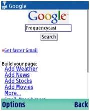
In the meantime, on mobile devices, the first phones could only access WAP portals, pages with few elements –some with RTF and simple graphics.
The globalization of the web
But devices evolved and became more versatile: screens could reach increasingly higher resolution, and web pages had to pick one format or the other –the latest or the most widely used.
Finally, the first mobile devices able to navigate the internet and display sites which were originally designed for desktops appeared in 2007.
In 2010, the insertion of tablets in the market tilted the balance in favor or mobile devices: consuming content on them was incredibly handy, so web designers had to figure out how sites could be properly displayed on mobiles as well.
This resulted in changing closed platforms such as Flash for new standards like HTML 5, which allows pages to be dynamic and adapt according to the area available on each screen.
We recommend: Are you ready to face the new labor pattern?
Before and after
To give you an idea of how much web pages have changed and how important responsive design is, have a look at this old page of Space Jam, from 1996.
If you visit the page from a desktop computer, you’ll see that most of the area is covered by a repetitive background, and if you change your window size, the page will remain the same. This is because elements have a fixed size and position.
However, if you visit the site from a mobile device such as a phone, you’ll see that elements are tiny and you need to zoom in to see them correctly:

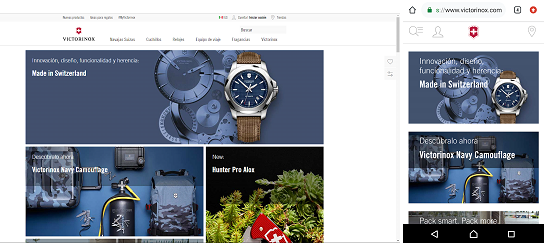
Now let’s see how a responsive web page these days reacts. We’ll take Victorinox site as a way of example, which has an elegant, quite discreet, modern design. Try the experiment once again: change the window size and you’ll soon notice the difference.
When you display the page on full screen, you can see lots of information and graphic resources with a good use of space. If you narrow it a bit, empty spaces will be reduced. If you narrow it even more, unnecessary texts will disappear and only the most relevant visual elements will be left on display.
If you visit the same page from a mobile phone, you’ll find a pretty enjoyable version, with large buttons, perfectly legible texts, and visual elements are chosen over text buttons.
If the page finds a big display area, the preferred elements will be those you can interact with using a mouse. On the contrary, if it finds a small display area, the priority will be conveyed to elements you can interact with using your fingertips on the touch screen.

This article may be helpful: Everything you need to know about mobile usability and its impact in ecommerce
Why is responsive design important?
Imagine you’re willing to buy a camera. You browse the web for the model you want on your phone and the first result you get is an online store with quite an interesting, affordable price. You don’t think it twice –you click on the page but right then you notice it’s not optimized for mobile devices.
You’re ready to find out more information, but it’s hard to navigate through the menus and see the images. This is frustrating, so you close the window and go for a new site. Despite the good price advertised, the page has just lost a sales opportunity.
Responsive design makes sure that this won’t happen to your website. Offering a portal available for all visitors dramatically reduces rebound and increases the time spent at the site. Both factors are highly desirable if you’re implementing an inbound marketing campaign.
Learn more in: What is Inbound Marketing?
How are responsive websites designed?
It may seem pretty simple, but the truth is that there’s a lot of programming behind a responsive web design. Just imagine that the Space Jam page we used as a sample above has 637 lines of source code. In contrast, Victorinox site is built using 3118 lines.
This doesn’t mean you need to hire a lot of web programmers. Most hosts count on perfectly responsive templates that can be customized with information from your web page.
Learn more about responsive design
Although it’s quite a technical feature, it’s worth learning more about this topic. There’s no need to be a computer engineer to keep up with the benefits and news of responsive design.
To this purpose, we’re sharing this selection of learning resources with you:
- Responsive Web Design – By Alistapart
- The fundamentals of responsive website design – By 99Designs
- Understanding the difference between Mobile-First, Adaptive and Responsive Design – By Frederic Gonzalo
- What is and what is not responsive design and design for mobiles? – From Monge Malo
- Top 5 Ways Responsive Web Design Benefits Your SEO – By Search Engine Journal
- Responsive Design – Best Practices and Considerations – By TopTotal
- Why you need to invest in Responsive Web Design – From Convince & Convert
- Responsive Web Design today and where it’s heading – From Art Version
Do you need help with the responsive design of your website?
At Workana you’ll find a lot of freelancers widely experienced in web programming who will readily make your website perfectly adaptable and user-friendly so that your visitors in time can become clients.
What is Workana?
We invite you to know Workana, the leading freelance marketplace. We’ve been working since 2012 to keep connecting companies and entrepreneurs with remote workers of the most diverse specialty areas.


